Introduction
Because coresuite cube is based on standard products like Microsoft SQL Server and Analysis Services, users have a lot of advantages beside the speed and power of OLAP: The flexibility, the smooth Excel integration without plugins or the permission model are only a few. There are lots of 3rd party products available which can be used with coresuite cube. This time I want to present mobile self-service BI (business intelligence) on the iPad with ReportPlus.
General Information
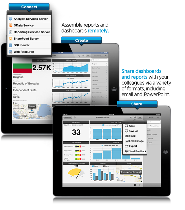
ReportPlus from Infragistics, available in the apple App Store, is an easy to use self-BI product which is able to connect to different data sources. One of the data sources is Microsoft Analysis Services, which we can use to connect to coresuite cube. Without any consulting, users get completely new possibilities:
- Ease of Use: Easily create dashboards, without any programming required, just drag and drop data sets in a friendly WYSIWYG user interface!
- Visualize: Use multiple data visualizations, including grids, a variety of chart types, maps and gauges for KPI’s!
- Anywhere access: Find correlations between your data sets online, or offline!
- Collaboration: Share business insights with others right within ReportPlus!
There are two products available:
- ReportPlus Lite (for free): Different limitations, can for example only display some rows.
- ReportPlus (~23 EUR): No limitation
Configuration
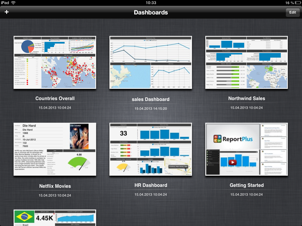
After installing the app, it contains already sample dashboards based some external and internal data sources. We start adding our own data source with the + button on the top left and then just chose one dashboard template.
The next step is to add a new data source, which can also be done with the + button on the top left. Please choose Analysis Services as system.
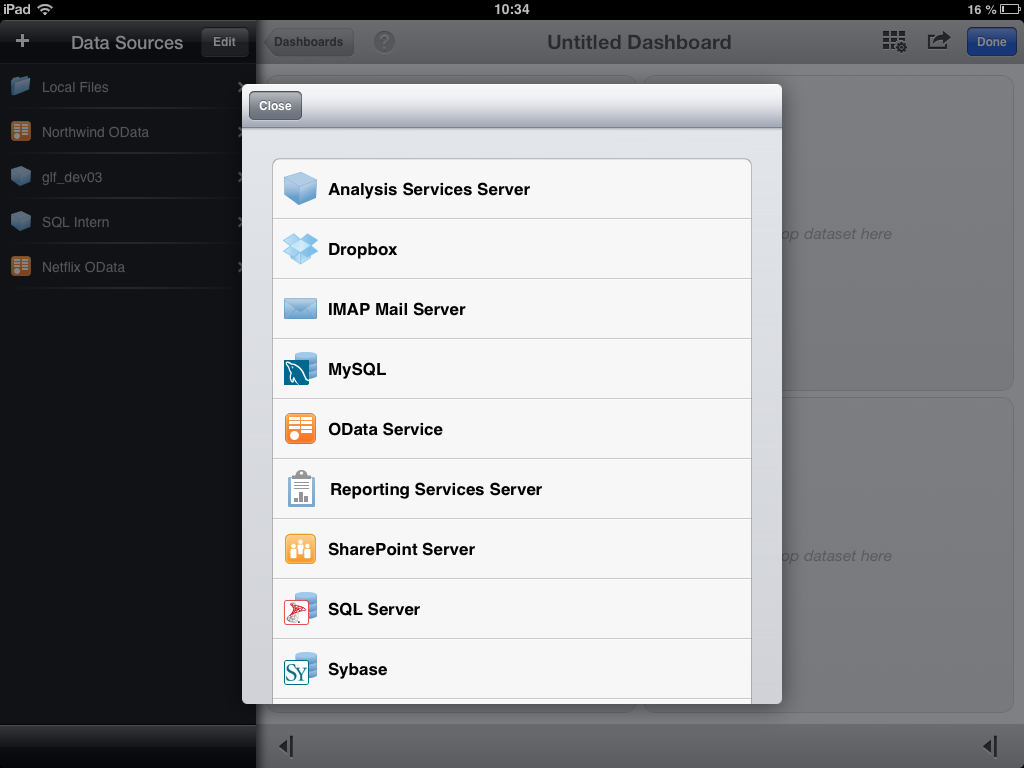
Normally it should be enough when you use the name of your Server. If your Analysis Services is installed on a separate instance, don’t forget to indicate it, for example like MyServerName\MyInstance. When the SQL Server Browser service is running, the app connects without problem to separate instances.
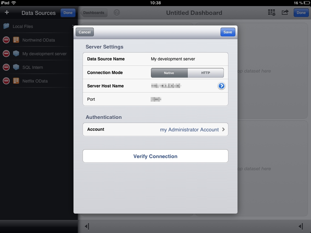
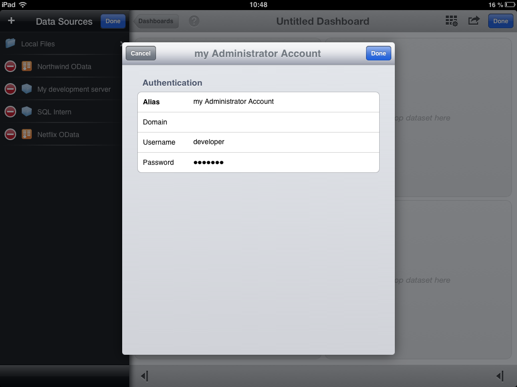
In the Account part, it is necessary to save a windows account. The app divides login information in 2 parts: One part is the server, and the second part are the credentials.
The last step of the connection setup is the verification with the corresponding button. When the app is able to make a connection, it is indicated with a message.
Creation of Reports
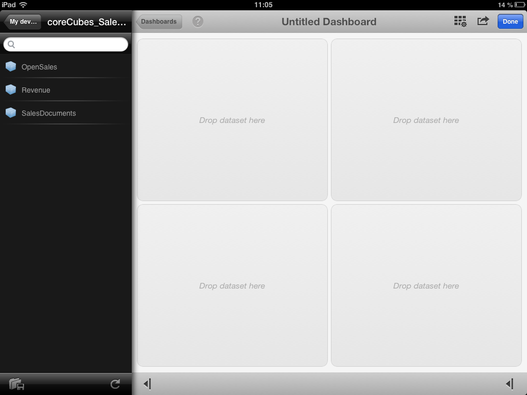
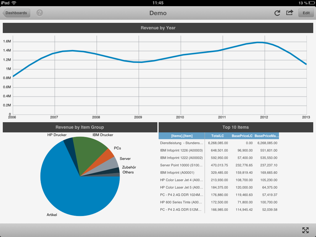
Let’s start with the interesting part. We browse in our new connection to the Revenue Cube and drag it into the window.
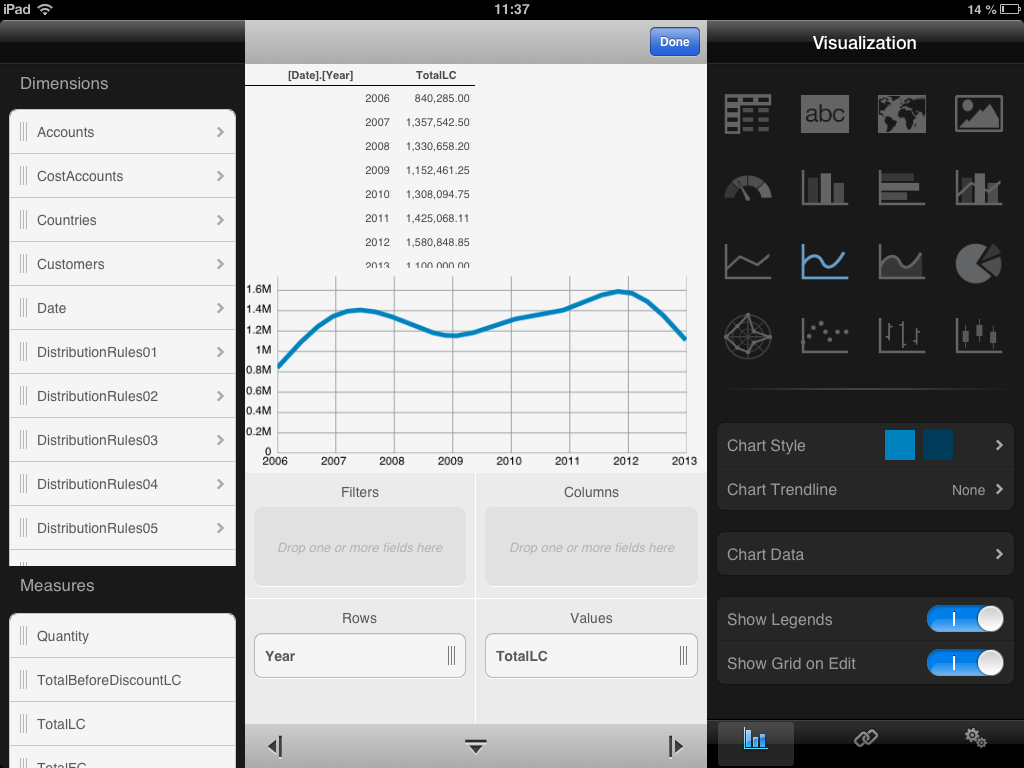
Let’s make for example a chart, which compares the revenue by year. Just drag a measure, for example TotalLC into the values field, use the Year from the Date dimension as row property. As visualization, I choose a line chart.
There are lots of possibilities, but it makes no sense to show everything here. This tool is so easy, just play around!
4 Comments
Geri Grenacher · April 25, 2013 at 05:41
ReportPlus 2.0 is out now. It contains more formatting options and features.
India · September 18, 2014 at 04:18
Valuable info. Lucky me I discovered your website accidentally, and I’m stunned why this coincidence didn’t came about earlier!
I bookmarked it.
Advanced cube reporting with budgets based on Excel formulas | Geri Grenacher · October 13, 2013 at 04:56
[…] cube, based on Microsoft Analysis Services, is a flexible tool. We can access it via browser, iPad, Excel and much more. This time I want to focus on the Excel. For doing self-BI (self-service […]
Share dashboards produced by ReportPlus | Geri Grenacher · March 7, 2014 at 12:49
[…] a former post I introduced ReportPlus, which is a nice iPad app to create dashboards. Because there is no server component, the layout […]